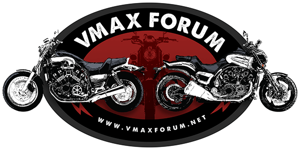
Need help from a Graphic artist

VMAX  Forum

Help Support VMAX Forum:

This site may earn a commission from merchant affiliate links, including eBay, Amazon, and others.
Hey KJ-if you put up your skull graphic (preferably with an alpha channel) I'll grab it and incorporate it into a newer burnout version.
Thanks.
 
I do like the skull but also agree it is a bit HD cliche. How about using drag tree lights or using the tuning fork logo as directional pavement below each bike?
drag_tree.gif
 
Here is What I came up with Just another idea to kick around
 

Attachments

  • Logo01.jpg
    Logo01.jpg
    156.7 KB
  • Logo02.jpg
    Logo02.jpg
    101.5 KB
Thanks KJ I'm not sure how easy it would be for putting on a shirt. that's why i did the other one. By the way can you see the "face" in the flames?
 
Another offering toward the new site banner selection.
http://www.firsttakestudios.com/vmaxforumlogo4.html
The skull is back, the burnout stayed, the font is changed, a little inversion fading. I liked the more 3d look of mjsonar's work, and that would work for a tshirt, but for a site banner it might be too large and I'd have to keep the bikes too small...but I'm open to any suggestions on all of the elements. We've got the pro-skull faction and those who are tired of skulls (and the association with it being cliche and overused by the Harley crowd). Buster, I don't even know if you're willing to go with a flash banner for the site--what's your opinion on that?
I'm all ears.
 
Thanks to the hi res graphics you passed me it turned out fairly well. The problem is, first I need to know if Buster is willing to even use a flash banner. Do we keep the skull? Maybe have a vote of some kind? Maybe Buster should just decide, since it's his time and energy going into keeping up the site.
 
I don't do skulls and cross bones either but I think the job done is awesome. I'm a less is more kinda guy...
 
Here's another one that adds a different way of applying the text that I kind of liked...but it's definitely in the 'more is more' category, hehehe. I know I can get carried away with this crap, 4gasem, which is why I need minimalist perspectives like yours to throttle me back!

www.firsttakestudios.com/vmaxforumlogo5.html
 
Here is a retouched version bigger bikes smaller vmax words. it might fit on the banner better. what do you think?
 

Attachments

  • Logo03.jpg
    Logo03.jpg
    106.7 KB
Last edited:
Thanks to the hi res graphics you passed me it turned out fairly well. The problem is, first I need to know if Buster is willing to even use a flash banner. Do we keep the skull? Maybe have a vote of some kind? Maybe Buster should just decide, since it's his time and energy going into keeping up the site.

I'd use a flash banner as it looks really good. However it would need to be resized to 150px height to fit this format. I wouldn't want it to "reload" though every time someone changed forums though.
 
Here is a retouched version bigger bikes smaller vmax words. it might fit on the banner better. what do you think?

Wow, I really like that! :worthy: I'd like to use it as the logo banner for the vbblue skin, is that OK? Also is it possible to resize it? Banner height is 150px and maybe if you can make it wider.
 
I'd use a flash banner as it looks really good. However it would need to be resized to 150px height to fit this format. I wouldn't want it to "reload" though every time someone changed forums though.

Here's a new flash banner, the size you requested. The new size (wish I had known about that earlier) dictated a whole new approach. This version is based on lightninggrant's suggestion, mjsonar's use of 3d lettering, and still uses the graphics donated by KJ and redbone. It's still nice and small, weighing in at less than 200kb. I figure you could use the still (jpg) from the last frame for all pages but the index, this way it won't reload the flash..

http://www.vinandcheryl.com/vmaxforumlogo8.html
 

Attachments

  • vmaxforumlogo8.jpg
    vmaxforumlogo8.jpg
    103.2 KB
Here's a new flash banner, the size you requested. The new size (wish I had known about that earlier) dictated a whole new approach. This version is based on lightninggrant's suggestion, mjsonar's use of 3d lettering, and still uses the graphics donated by KJ and redbone. It's still nice and small, weighing in at less than 200kb. I figure you could use the still (jpg) from the last frame for all pages but the index, this way it won't reload the flash..

http://www.vinandcheryl.com/vmaxforumlogo8.html

That is great work! Can I get a copy of the flash so I can integrate it into the forum?
 
Back
Top