You are using an out of date browser. It may not display this or other websites correctly.
You should upgrade or use an alternative browser.
You should upgrade or use an alternative browser.
Ugly Gen 2 Vmax
- Thread starter customizedcreationz
- Start date

Help Support VMAX Forum:
This site may earn a commission from merchant affiliate
links, including eBay, Amazon, and others.
davesax36
Well-Known Member
I like it, or at least the idea.
customizedcreationz
Well-Known Member
The Gen 1 scoops throw it all off for me. They don't follow the lines of the bike. I think thats what kills it for me. They look like they are just thrown on.
customizedcreationz
Well-Known Member
Ah... much better !!! My eyes feel good now!

$61.70
$64.99
Yamaha 2005-2015 VX110 Deluxe Cruiser Sport VX 110 V1 Oil Change Kit w/NGK Spark Plugs Set
Port Yamaha

$15.15
$21.95
Tough Headwear Balaclava Ski Mask - Winter Face Mask for Men & Women - Cold Weather Gear for Skiing, Snowboarding & Motorcycle Riding (Black)
Tough Outfitters

$22.09
$25.99
MOREOK Waterproof & Windproof -30°F Winter Gloves for Men/Women, 3M Thinsulate Thermal Gloves Touch Screen Warm Gloves for Skiing,Cycling,Motorcycle,Running-Black-XL
MOREOK-US (Ships from USA)

$13.99
$14.99
Marsrut 3Pcs Motorcycle Valve Adjustment Wrench Tool, Universal Engine Screw Sleeve Spanner 8mm/9mm/10mm Metal Set
Study Kitchen
Born2Ride
Well-Known Member
The gen1 scoops follow a straight line which is suitable for a cafe racer style. Sure that the newer scoops will look better but it's a cafe racer, It should look different which it does.
I thought it was a cool look with the old scoops. Over all I liked the bike, it wouldn't be my everyday ride, but yes I would ride it...
jedi-
Well-Known Member
I like it. A different paint job would seal the deal.
Atleast he's in the garage and not out mugging or killing people . not my cup of tea tho
Tex85
Well-Known Member
I like it. A different paint job would seal the deal.
I'm with you, different paint would make it much more desirable.
Biker Dash
Well-Known Member
Ok, I feel they had an excellent idea that was poorly executed.
As in executed at dawn... via firing squad.
As in executed at dawn... via firing squad.
All in all......not too bad. It's very different. ...I'll give you that.
Hellboy
Well-Known Member
I'd have it. Sounds incredible as well.
Matt
Matt
98Redlne
Well-Known Member
Not my cup of tea. If the desire was to have that "home built" cobbled together cafe style racer look, I think he achieved it, however it was at the expense of any flowing lines the bike had.
Not that it is even in the same league however I think the Lazareth bike has much better overall styling
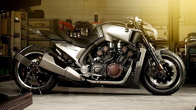
Not that it is even in the same league however I think the Lazareth bike has much better overall styling

Biker Dash
Well-Known Member
Not my cup of tea. If the desire was to have that "home built" cobbled together cafe style racer look, I think he achieved it, however it was at the expense of any flowing lines the bike had.
Not that it is even in the same league however I think the Lazareth bike has much better overall styling

The only thing I would wish different is the tail section of this one. Beyond that, this bike looks nearly perfect! Very much what a VMAX should be.
Similar threads
- Replies
- 3
- Views
- 353
- Replies
- 2
- Views
- 241






![Bovemanx Motorcycle Phone Mount Holder, [150mph Wind Anti-Shake][7.2inch Big Phone Friendly] Bike Phone Holder, Motorcycle Handlebar Cell Phone Clamp, Compatible with iPhone 16 Pro Max Smartphones](https://m.media-amazon.com/images/I/51F+1sontPL._SL500_.jpg)

